nobirunstyle in Switzerland
Once in a lifetime experience of Architecture
Search
2011年01月15日(土)
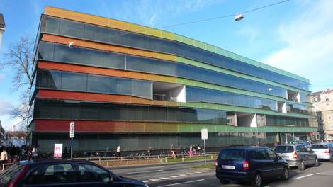
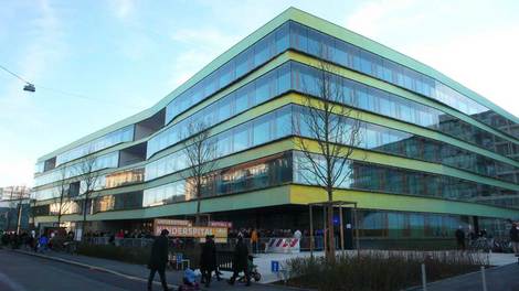
Kinderspital Basel / Stump & Schibli Architekten
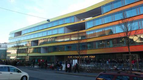
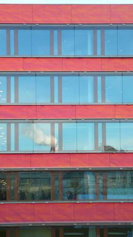
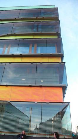
The material of the facade is quite interesting. If you see from deep angle, it looks green...
But when the angle gets close to 90 degree, the surface looks red.
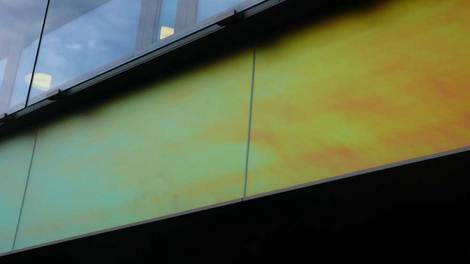
Close up. The special film behind the glass seems "3M Radiant Light Film" with which you can control the range of color you can see as well. The detailing should be interesting.
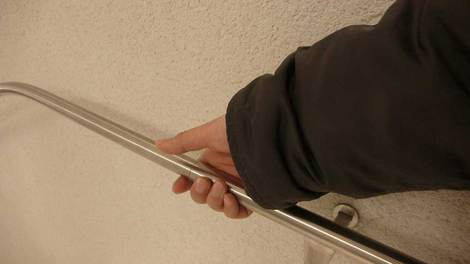
Just I found the hand rail is thiner than the ones I know.
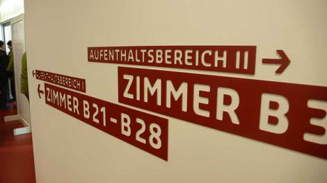
Sign planning by Integral Ruedi Baur, Zurich
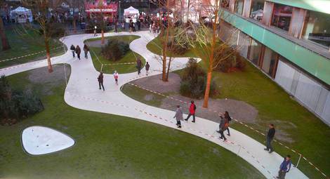
Landscape design by Berchtold.Lenzin Landschaftsarchitekten.
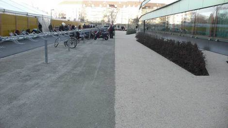
It was interesting, left side is with cement I guess, and the right is only sand, it makes clear line.
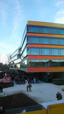
It was long cue when I went there for the open day. It's amazing how many people are interested in such new building. Are they really want to know about the architecture or just the function of the hospital?
